Friday, February 22, 2013

Skin and Image


When the February 2013 print issue of US Vogue Magazine was released, it included a piece on the British painter Cecily Brown.  On page 259 there was a statement by Brown that struck me.  So I marked it with a pen. The quote is above.  

Being a painter too, I can begin to understand what she meant.

From what I know of her work, sexuality and attraction are dominant themes. This implies the human figure, the other most striking visual presence in her work.  Whether darkly concealed, smothered, or surfacing in gooey, slippery and kaleidoscopic landscapes of oil pigments –landscapes that eventually come to form as recognizable places like a forest or a bedroom- the nude body or bodies emerge, by itself or moistly intertwined with another, in justified repose or intimate pose

With such overt and unapologetic sexuality in her paintings, at first it seems that it’s no surprise that Brown mentions the word "skin" in the interview. But it must be more than that: such as the idea of skin as an analogical device or formal metaphor upon where the meaningful viewing, necessary entanglements and deep comprehension of artworks bank their premises on. 

A favorite art professor of mine once wrote: “painting’s analogy to skin is not new.”  It sounds like a good place to start reconsidering Brown’s quote.

photo credit: Kamilla Bello
18 square feet –that is the measure of the skin of our bodies.  It is our body’s largest sense organ.  It is also the sense organ that is always on, in a “constant state of readiness to receive messages.”[1] It is also the outermost boundary of our body.  If put into analogy with our planet, our skin would be the Earth’s crust: it covers the entirety of the planet, it is the last place of contact when leaving the Earth, it is the first place of contact when meeting Earth.  But the Earth’s crust is extremely thin- it amounts to less than 1 percent of the planet.  Whereas skin amounts to 16 percent of our body weight.  This attests to skin’s significantly concrete presence.

And so I cannot help but find a beautiful yet uneasy dance between the words “skin” and “image” in Brown’s quote.  To “get under the skin of an image” feels like the equivalent of watching polar opposite creatures having a love affair that is destined to die.  

Image amasses its power in its elusive, shape shifting, and opportunistic nature.  It defies being exclusively possessed by anybody or anything whether by time, place, entity, language, idea, cause, or even by its object (if there ever was one to begin with!). Whereas skin is simply possessed by one body.

The breadth of image’s reproducibility is infinite.  Skin can only venture, well, skin-deep. 

The image is the flawless and timeless ideal that embodies desire.  Skin is flawed, rife with fissures, and is in agreement with time's conditions. 

The image is the “site of resistance to meaning.”[2]  The skin is the body’s first site of resistance.

To try to “get under the skin of an image” can only mean subjecting the image into an embodiment that it is not constructed to be, and implicating the skin into giving the image a surface that will only render it penetrable.  What is exciting about Brown’s quote is the violation of image and skin’s established conditions.
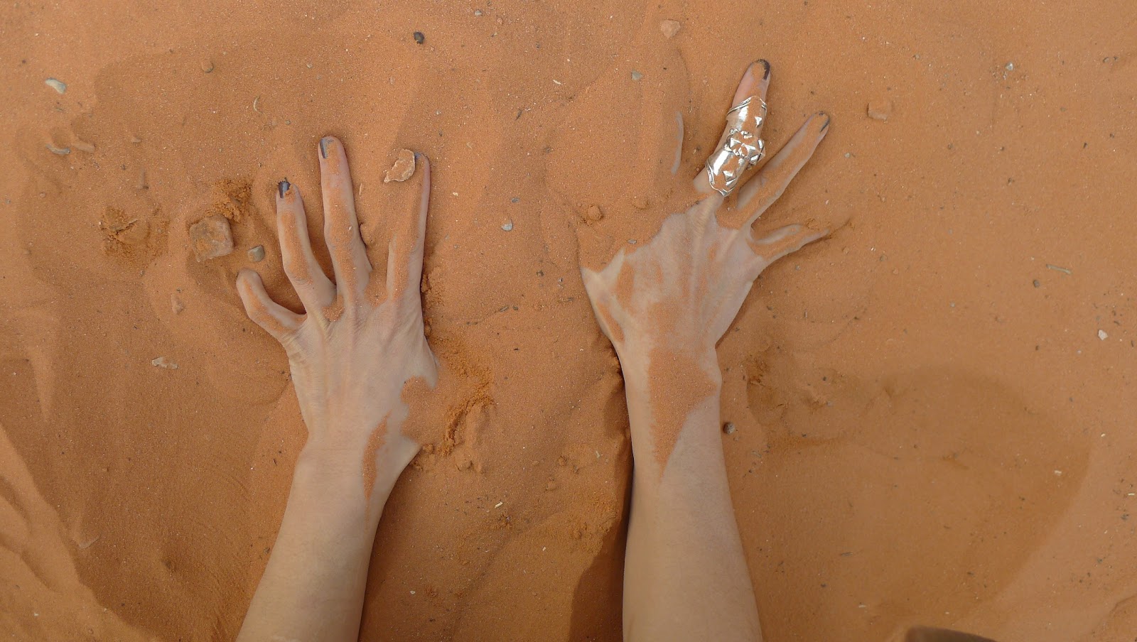


It is with this quote in mind that I am rethinking my series of photographs taken in certain natural environments in the Southwest and Northeast.  In it I photographed my hands gouging through sand, grazing through snow and sleet, grasping boughs, channeling through gashes in fallen trees, stroking the furrows of petroglyphs. 

As if my lived and sensory experiences of canyons, deserts, forests, snowstorms, and hurricanes aren’t enough to establish my sense of awe and wonder of nature’s otherness, I physically entwine my hands into the matter that contain, shape and define these places- and then photograph these acts!   I am reminded of Thomas the Doubter who needed to touch the wound of the resurrected Christ in order to eradicate his doubt and establish belief in the resurrection.

I can argue these photos as trying to “get under the skin of the earth" -that they are a lesser violation or semantic conflict than trying to “get under the skin of an image.”  But the creation of the photographic images nulls the argument.  When this or that experience is flattened into the photographic print, the sensory experience of getting under the skin of the earth now enters the realm of the image.  It is no longer about the skin of the image, but the image of the skin.


[1] Tiffany Field, Touch, (MIT Press, Massachusetts, 2001), p. 10
[2] Roland Barthes, Responsibility of Forms, (University of California Press, Berkeley, 1985), p. 21

Wednesday, February 20, 2013

Thank you Aferro!

I want to give a big thank you to Evonne and Emma for giving me the opportunity to work at Aferro for the past six months.  The residency seemed to fly by, as I was able to work on a large scale self-portrait.  

It was great meeting and working alongside such a talented, diverse group of artists.  Being apart of such a creative environment always seems to inspire my own process.

Look forward to seeing everyone at the opening this Saturday and good luck to all the incoming residents!

Monday, February 18, 2013

That Sad Desire


I wish I remembered my dreams more often.  Usually I feel completely tangled up in them when I first wake up. Then by the time I've had coffee and left the house I have no idea what it was all about. Here's one I wrote down before the spell was broken:

I dreamed I was in someone’s house.
I was with a crowd of people, artists.  They were interested in an artist that I know who was missing, though there seemed to be some of his work around the room. They wanted to see his films, and found an old VHS tape of “his movie” which I started to play for them.

The movie was a long (seemingly never-ending) series of micro-narratives, little vignettes each with a little joke as its defining thing.  The vignettes were family scenes, in or around a working class house.  The people all wore costumes, loose, sloppy furry outfits like sad comic theme park animal characters, big fuzzy caricatures of bears and dogs.  The sense of humor in the various actions of the figures was mildly scatological.

I paused the video to explain to the people watching with me (who didn’t know much about the absent artist) that when he and I were in school together, and for a while after that, he had been involved in a more occult and different aspiration in his work, that he saw and painted ghosts and strange spirits, but that later he turned from that and deliberately toward his idea of what is “good”.

My sense was that this film was about that turn to reach for goodness, but that in its form and structure as well as its abject gesture’s pathos and humor, it was helpless to not be an art better, bigger and more basic than that sad desire.

Saturday, January 5, 2013

Semi text

I haven't blogged yet. And while there are a variety of pointless excuses for this, in reality it's because I often feel that words are my enemy. I can use them, manipulate them, choose superb specimens as an end to a means, and turn a nice phrase, but none of this matters because the WORD, language itself, is the nemesis of the image.

I communicate through images, they tell my stories whether it be tattooed on my hands or painted on a piece of wood. I often want to give language to the image, but the words do not come. The words laugh at me and tell me to keep my eyes closed and then I might understand better how to transform visual into aural.

It's not a dance, it's a duel.

Somehow I am still possessed of this idea to write accompaniments to my paintings, even though I truly believe the paintings should tell their stories without needing words.

Maybe I need the words. The WORD, to unlock all the stories in a single gush from my fingertips. Or maybe more like a flood of tears.
I could be afraid of the words because they are not as aesthetically pleasing to my mind as the images.

The sound of a woman wailing is the saddest thing you can hear.
I think sometimes if I let the words come they will only be a formless wail announcing to anyone who can hear all of my sadness and I don't really want any of you to know about that.

What Were They Thinking?


Looking at Jan Lievens' paintings from around 1631 it's interesting to wonder what was going on. Lievens was a contemporary to Rembrandt and some have confused the two over the years. I've been studying a few of his paintings and creating them anew through my eyes. My interpretation of "Boy in a Cape and Turban" above, depicts a milky faced youth, stuffed and stiff as nails, with all the pomp and circumstance of his exotic "Oriental" attire. Lievens spared no detail in his depiction of clothing and also the psychology that was going on with the subjects of his time.

Sunday, December 16, 2012

Brick City Project!!


Hi all....stopping by to wish the current studio residents mucho love on their artist journey this season.

Also, Brick City Project makes an appearance in Metro 29 art show still goin on now for all who havent seen.  Stay tuned for more photos as i get closer and closer to completing the 1st installation of BCP....(super excited).....stayed tuned also for future  appearances by other bricks as the momentum gains.  Newark Museum and a few Nyc galleries are jus the appetizers  for this artistic cuisine. There are big, BIG plans in the making so keep your fingers crossed and your hearts open for whats to come.  Peace and Blessings....Malik

Friday, December 7, 2012

Art from the Outside Looking In


I would not consider myself someone who knows a lot about art. I love museums and galleries and frequent them often and I’ve taken an art history course in college (and loved it), but I don’t have extensive knowledge or a strong contextual art background to legitimize the way art speaks to me amongst the art community. But do I have to? I might not get it. I might see something and say, why? But isn’t that what is most important? That the artwork in front of me is making me think? While walking around the current show installed at Gallery Aferro, there was art that I “got” under my own pretenses, and there was other works that were, perplexing. Nonetheless, the space is beautiful and the show as a whole, was provoking and inclusive to all types of art. There is something for everyone. I think that art is a personal experience and that everyone has their own individual connection or misconnection to each piece.

I wouldn’t consider myself necessarily as a visual person. When I see things, I don’t necessarily feel things. The pieces that spoke to me the most had words and sounds, had an actual voice I could hear and read. As a media studies major, one of the most thought-provoking pieces was located on the floor in a black basket on the second story. Shani Peter’s Reagan, The Revolution, and Me explored her own personal “socialization and understanding of blackness and family through references to media and imagery I absorbed as a child.” Her piece exposed how the black family was translated through media, and it was eye opening. It struck a chord within me. I don’t necessarily know what chord that was, but do I really have to? It made me feel.

So who am I and what is this post all about and why are you reading it? My name is Brady Smith, a senior at NJIT in Newark and Gallery Aferro’s new social media intern! I’m excited to join this great group of people and learn in this new world of art that I’ve only topically explored. So if you see me around the gallery, feel free and say hi, or tweet me at @smithbradym (shameless social media plug). 

Monday, December 3, 2012

Mana Contemporary

I had time on Sunday to take a trip to Mana Contemporary for their open studios.  One of my neighbors (Frank Gavere) from Parkway Studios in Bloomfield now has a space in this Jersey City oasis.  

The first floor was holding a small Keith Haring exhibition.  He is an artist that I have not given a great deal of thought, but being able to see a body of work up close and personal helped give me a new appreciation.  The first floor also houses an area where an artist can have crates made for their shipping needs.

I believe there are six floors to the building, but I only took a look on the 4th where it seems most of the artists have their studios.  The elevator opens up to a gourmet cafe.  There was a great Allison Schulnick painting hanging in the hallway.  

The artists' studios varied in size with some of the bigger names having huge spaces.  One artist had the biggest printers I've ever seen.  There was a dance studio as well where a demonstration was taking place.  

Mana is an impressive space and has every amenity an artist can imagine.  I don't know if all of it is necessary, however, to do good work.  It is worth a visit though; http://www.manafinearts.com

Saturday, December 1, 2012

Anne Q. McKeown

Besides doing her own great work, Anne is the Master Paper Maker at the Brodsky Center for Innovative Editions. Here is an article about her recent collaboration with El Anatsui.

Sunday, November 25, 2012

Self-Portrait

     The project I've been working on at Aferro has been ruminating in my mind for a couple years. 
     The springboard for this piece came from looking at Chuck Close's 'Big Self-Portrait'.  I did a smaller version which was to serve as a template for the final work, but didn't have the space until now to see it through.  The small version was in included in a group show, 'Nonsense', curated by Jill Wickenheisser at Seton Hall Law.    
     As an artist, I sometimes struggle with the idea of 'am I good enough?'  The attitude Close conveys in his work embodies confidence and defiance at a time when Clement Greenberg had said there's only one thing an artist can't do any more and that's paint a portrait.  While I would like to channel more of Close's self-assurance in my process, the image I wanted to create with this piece was one of naive wonder.  The image comes from my class portrait sometime around 2nd or 3rd grade, with these colorful cellular blobs making their way in from previous paintings.  The eyes I incorporated were Spongebob's; being that I have two young sons, and that seemed to be all that was on our tv for awhile.

Chuck Close's 'Big Self-Portrait'


My painting in the early stages


Friday, November 16, 2012

First Time Around


Walking into Gallery Aferro for the first time, well technically the second, I was intrigued. The awkward green floors, large white walls filled with color, and warehouse ceilings somehow made it an incredibly charming space.


I wanted to explore everything- so I did. Once I took a lap of the first floor, I needed to see what was up the gray staircase that had caught my eye the moment I walked inside.  The upstairs was just as funky and charming as I had hoped. It had soft lighting, and was very intimate. The art felt like it was encompassing the room; it felt like a space you could lose track of time in.


After walking through both gallery floors, I continued onwards and upwards to the studio space. Being a painter, I thought the studio space was amazing. The character of building paired with all of the art being created was inspirational, to say the least.  I felt like every space in this building was holding a little something new, and unexpected. 

...By the way, I am the new curatorial intern at the gallery! I'm a painter, and hoping to gain some great experiences here. I'm looking forward to working at Gallery Aferro and meeting everyone!


EFA Open Studios Visit


This post was delayed due to Hurricane Sandy. Hope you and everyone you know braved the storm well!

Maybe it's my own negativity, but I think we've all been guilty of this: Cynicism, when going to view art. We go to the galleries expecting to see a lot of crap, a good amount of decent work, and every once in a while something that you really connect with. A few weeks back, during my visit to the Elizabeth Foundations Open Studios my cynicism was turned on it's head. I can't overstate this, everything I saw was good. Maybe I just had an easy going day, maybe my mind wasn't in criticism mode, regardless, all the work I saw there was beautiful and moving. Another form of cynicism (especially when going to view work in Manhattan) is the tendency to expect the studio/gallery sitter to not really care about your existence. It always seems like such a painful task to ask the gallery attendants in Chelsea for an artist statement if the pile of print-outs has ran out. As I walked in to the studios I was consistently greeted by the artist or sitter and they wanted nothing more than to inform me about the work and enjoyed talking to me about the pieces in detail. It felt like I was at Aferro where we all know each other and when you walk into the other person's studio it feels more like a conversation with an old friend about their art than someone I've only known for a few months.

Now, there was a few artists I would like to talk about specifically but I wrote that opening paragraph because I want to applaud and thank the EFA for not only choosing such great and friendly artists to give studios to, but also for putting together such a great open studios that was nothing but enjoyable. 

So thanks, guys!

There were two artists that I knew before hand and were excited to see, Bryan Whitney and J.C. Lenochan. 

J.C. is a great guy and his work is just as awesome (and is pretty well known in the Aferro world). He has a large installation at the Mason Gross Galleries in New Brunswick right now at 33 Livingston Avenue. Although I haven't made it over to New Brunswick yet, I'm planning on going soon and you should do the same. Here's a link to his work and info about the show at Mason Gross:


Bryan Whitney was a teacher of mine at Mason Gross. He taught me 4x5 and digital processing. He was really a great teacher to me and it was so nice seeing him. I know it's not at all fair to only talk about people I know (my favorite work of the day was someone I had never heard of) but Bryan's negative images of cell phone towers are just fantastic. The quality of his prints can't be overstated, and the idea of the negative is something I've been thinking a lot about lately (especially due to Geoffrey Batchen's guest blogging at http://blog.fotomuseum.ch/). The work is stunning, surgical, abstract but still representational. Just great, and any fan of the Becher's will be immediately drawn to his work. His website has the still frames but he also had on display a few stop motion videos of the cell phone towers and they were absolutely stunning. They're hard to describe exactly, tiny motions of the shadows, stark white stillness of the towers, and the fluid grazing of the clouds made for a hypnotic experience. His work can be found at:


So, enough about the people I know. If all the art was so good as I said it was, I should of discovered a plethora of great work, right? 

Right. Quite a few artists either didn't have a card for me to take away or were too busy talking to other people for me to really interact, so I apologize to all the artists who's work I enjoyed but I can't point out specifically. 

Some I can point out specifically is the work of Saya Woolfalk (Sayawoolfalk.com). She has shown at the Newark Museum (she was also an artist-in-residence at the Newark Museum) and currently has a solo show up at the Montclair Art Museum. Noah Klersfeld's (noahklersfeld.com) video installations were absolutely entrancing. I must of spent 10 minutes just staring at each video. One of the videos, with the wire fence and the red background, was really beautiful, I mean, stunning. Hypnotic, abstract, graphic, mundane AND exciting (all at the same time). Noa Charuvi (noacharuvi.com) was another great one. Her work was very socially and politically charged but didn't scream in your face (and the way she paints is fantastic). The work is powerful and beautiful at face value, and once I spoke with her and understood her thought process, it just got better and better.

Now for the big reveal, my favorite work of the day. Morgan O'Hara (http://www.morganohara.com/). Her work absolutely blew me away. Maybe she has an unfair advantage in my books because I love gesture drawings so much, and her series on John Cage is so relatable to me since I'm also a musician, and that she also did drawings of photographers. It's hard to put in words and I like it that way. Her work is just so moving to me, it's not about what I think about it, it's what I feel about it. I see the musician moving their hands, the photographers focusing their lenses. I can imagine the music and the feeling of playing the notes. She articulates the aura of the music, the experience. It's not photographic in its documentation, it's guttural, ephemeral, intense yet subtle, ultra specific yet unrepresentative. The work is everything you want out of heady conceptual work while fulfilling the want of simple, unadulterated beauty. Sorry Bryan, sorry J.C., sorry everyone else at EFA, Morgan takes the cake in my book. Before leaving I had spoken to her about drawing someone working with a 4x5 camera (as opposed to the paparazzi type photographers she had previously drawn) and I hope that I might have sparked some inspiration in her. I would love to see how she depicts the much slower and delicate process of 4x5 photography and look forward to following her work in general, 4x5 drawings or not.

So, all in all, I was overly impressed with the work, more than excited to see Bryan and J.C. and absolutely stunned by Morgan O'Hara, as well as the other artists I mentioned. Next year, I'll bring my camera, and take notes, and hopefully I've convinced everyone reading this to go next year as well!

Monday, October 22, 2012

Kyle's First Masterpiece

At the recent open studios at Gallery Aferro, my nephew Kyle was very excited to walk around and see what was going on. At a certain point, he got fidgety needed a little something to do. So imagine that, let's create a painting, what better place. It was great to see him get all riled about it. He started with using some marker, although I think that was old hat. But when I squeezed out some burnt siena, his eyes lit up. He wanted me to help, but he was more than happy to keep going on his own.

Sunday, October 14, 2012

color by numbers


Color is a proposition that I dabbled into from time to time.  It’s not because it’s an insignificant aspect of what I’m doing, but because it’s the opposite.  Questions about color – formal, historical, conceptual- are matters that are grave, crucial and utterly comprehensive.  Color is an aspect so serious and confident in its own position in all practices that it doesn’t flinch in discomfort when it’s the subject of conversations that depreciate it.  There have been many writings in the past that dismiss it for its light and flippant nature.  Yes, color is light, but I cannot stand by the flippant part. 

That said, perhaps light and flippant are a good place to start a certain thinking about color.  And what better embodiment of both words that to do this in the form of lists.  Lists are casual and inconsequential. Lists are fun!  Lists are tyrannical.  And Umberto Eco said that lists are primitive, they create culture, and we like it for the assumption that it has no limits.  He said we like it because we don’t want to die.

So how about we do the list in an equally unlimited form: in numbers!  But for now here’s a short one:

7 - the number of spectral hues that light was split into when passed through a prism, as discovered by English scientist Sir Isaac Newton

6 - the number of spectral hues that Newton may have actually discovered, according to some claims.  One claim is because he's linked to Mysticism, he might have chosen 7 because of the mystical properties tied to the number.  Another claim is that 7 corresponded to the musical notes of the diatonic scale.

1704 - the year that Newton's Opticks was published, a manuscript notebook where Newton suggests a correlation between the color spectrum and the musical scale.  


207 - the number of years after Newton's published Opticks, when Russian painter and art theorist Wassily Kandinsky published his Concerning The Spiritual in Art.  For Kandinsky, the correlation between sound and color was a lifetime preoccupation.  

30 - the age when Kandinsky gave up a career teaching law and economics to become a painter

3F2207, FFFF93, FFD556, FFFEB, FF90000 - number ID's of the 5 colors in the palette that resulted when an oil painting titled Odessa Port was uploaded to the web app, The Color Hunter.  Kandinsky made this painting in 1898, at age 32.  


3,361 - the number of likes for The Color Hunter page in Facebook (as of today's date)

13,809 - the number of likes for The Color Purple book/musical page in Facebook (as of today's date)

1,227,980 - the number of likes for The Color Purple film page in Facebook (as of today's date)

1,921,298 - the number of likes for Clockwork Orange film page in Facebook (as of today's date)


3,914,941 - the number of likes for United Colors of Benetton page in Facebook (as of today's date)

897 - the number of likes for The Green Party political ideology page in Facebook (as of today's date)

700AD - the first recorded use of the word green as a color term in Old English

200 - number of years later in China, when Mi Se was being produced and reserved for only the Emperor to see -let alone use.  It was speculated to be a kind of porcelain with a shade of green.  Mi Se means "secret color." Speculation went on until 1987, when a secret chamber was discovered in the ruins of a collapsed tower, that scholars were able to identify some genuine examples of the legendary porcelain.  They had been locked away for 11 centuries 

1701 - the year French baroque painter Hyacinthe Rigaud painted a portrait of Louis XIV wearing coronation robes and a pair of red-heeled shoes.  It was a period when red heels were worn only by the nobility.   


1911 – the year that French painter Henri Matisse painted The Red Studio, and saying about it: “ Where I got the color red –to be sure, I don’t know.” 

1949 – the year that Russian-American painter Mark Rothko stood in front of Matisse’s The Red Studio everyday for months following it’s acquisition by the museum of Modern Art. He remarked at the red field of color, ‘you became that color.’  

No. 21 -  the title given to one of Rothko’s paintings in the same year that was presumed to have been made under the influence of Matisse’s The Red Studio.  Not long after, he will make the painting titled Homage to Matisse

22,416,000 – amount in dollars in Nov 2005 that Christie’s set as realized auction price for Rothko’s Homage toMatisse

80 - the number of metric tons of the color red that was shipped to Spain in 1575 from the New World.  It became known as the cochineal fleet.  In addition to finding gold and silver in the New World, this was another treasure the Europeans found. It is a particular intense red -carmine- made from the blood of crushed female cochineal beetles.  A demand for it was born in Europe: for cosmetic fashion, carpets, fabrics.  

70,000 - the number of female cochineal beetles needed to make 1 pound of carmine dye.

E120 - ID number of color additive to Cherry Coke.  It is carmine dye from the same cochineal beetle.

3/2012 - month and year it was published at the Washington Post that Starbucks uses cochineal beetles as food coloring in their Strawberry Frapuccinos

1000CE - earliest estimated date of the cultivation and use of cochineal beetles inthe Toltec era of archaeological Mesoamerican culture. 


20 - number in the millions, in tons of indigo are produced annually for the purpose of traditionally dyeing blue jeans

3 - number of years in duration of Picasso's Blue Period, taking place between 1901 through 1904.  During this period his subject matter consisted of the poor and outcasts, primarily painted in shades of blue and blue-green, and it is recorded he suffered bouts of depression.

3 - number of years in duration of Der Blaue Reiter, formed in 1911 in Munich as a loose association of painters led by Wassily Kandinsky and Franz Marc.  Kandinsky wrote that the name isderived from Marc's enthusiasm for horses and Kandinsky's love of riders,combined with both love of the color blue. For Kandinsky, blue is the color of spirituality: the darker the blue, the more it awakens human desire for the eternal 

1873 - the year when Hermann Wilhelm Vogel produced the first orthochromatic films, sensitive only to blue light.

1976 - year Umberto Eco wrote an essay Lumbar Thought where he covered blue jeans. He wrote: “Well, with my new jeans my life was entirely exterior: I thought about the relationship between me and my pants, and the relationship between my pants and me and the society we lived in. I had achieved heteroconsciousness, that is to say, an epidermic self-awareness.”

1963 - the year Joseph Albers' book Interaction of Color was first published

2000 - the year David Batchelor's book Chromophobia was published

2009 – year Springer publishes a coffee table book Why Do Architects Wear Black?  One of the answers: “ ‘they are mourning their many unrealised projects.’ arno brandlhuber, berlin.”


2012 – year when a painting from Rothko’s “Black on Maroon” sequence was defaced at the Tate Modern in London. 

77AD – year Pliny the Elder wrote his encyclopedic Natural History.  It contains the basis of the Western classical legend that the first paint was black, and the first artist a female from the town on Corinth in Greece. Victoria Finlay ruminated on this on page 71 of her book Color


Feel free to add/edit on to the list if you're feeling Eco's thoughts.

Thursday, October 4, 2012

Ah Um

 Go ahead, laugh. You're among friends. You can put on the well balanced, well behaved face later. I don't know about you, but sometimes it helps to put on the other, groaning, laughing, cursing face. Depends on the day.


Monday, October 1, 2012

What do we think about when we are in our studios?


Whether we're making a painting, a drawing, shooting a photograph, a video, scripting a performance, writing a talk, engineering an intervention, planning out a collaborative project, or mapping out a place for a site specific installation - what's going on in our thoughts while we do what we do?


Monday, September 24, 2012

punching the clock

Studio time has ebbs and flows. Sometimes it's pretty steady and sometimes it fluctuates wildly. I'm trying to get into a more standard routine this fall and so far it's going pretty good. I've been thinking about it more since I did a project for the College Art Association's career development pages. They just put up a podcast of it called Hybrid Careers: the work of balancing your work.